The Sales Graph Report provides a graphical representation of your sales over time, enabling you to view overall sales trends. You can also view current sales against a comparison period to see how your business is progressing.
Note: The Sales Graph Report is available on central servers, where the sales data will be combined data across all sites.
To access the Sales Graph, hover over the Reporting Icon from the left-hand navigation. Click the Sales sub-category & select Sales Graph from the available reports. You can also view the sales graph for any of the time periods shown on the dashboard by clicking the relevant graph.
Grouping options
You can group the Sales graph report to show sales by the following:
- Root category (wet, dry, other) - view sales broken down by top-level category
- Employee - view sales broken down by the employee who took the sale
- Terminal - view sales broken down by the EPOS device on which they were taken
- Online vs In Person - view sales taken online (via mobile ordering, or Deliveroo) vs those taken in person
- Sit in vs takeout - Sit in vs takeout sales
View by
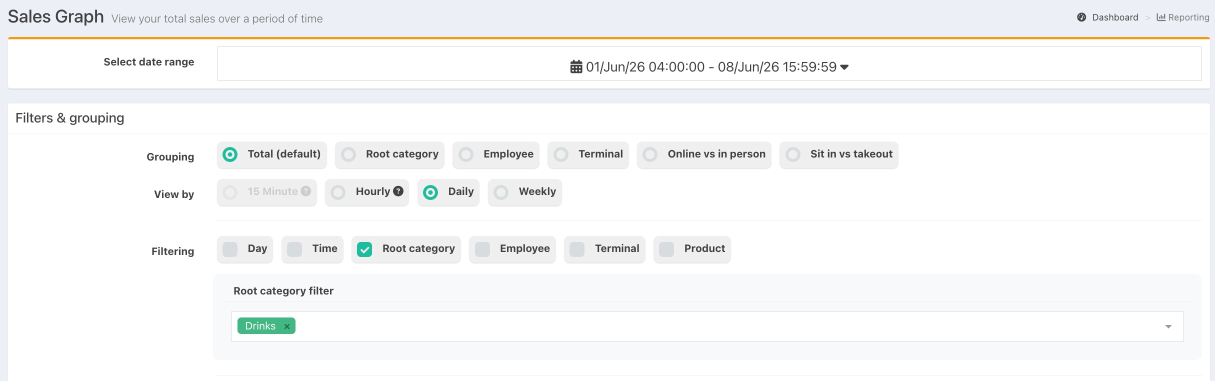
When viewing the Sales Graph, you can set the time range you want to view, and the granularity of the graph:
- 15-minute - Sales shown per 15-minute intervals (available when viewing a period of 24 hours or less)
- Hourly - Sales shown hourly (available when viewing a period of 14 days or less)
- Daily- Sales shown daily
- Weekly- Sales shown weekly
Filtering options
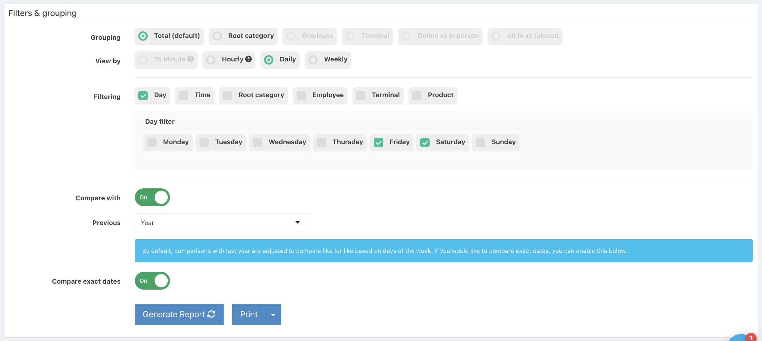
You can apply one or more filters to see a graph of sales that match your specified criteria. For example, you could see how your draught beer sales are changing over time, or narrow down to just your Drinks sales on Friday or Saturday evening between the hours of 7pm-9pm.
You can apply any of the below filters:
- Root category - Only show Drinks, Food or Other root category
- Employee - Only show selected employees
- Terminal - Only show from selected terminals
- Product - Only show selected products
- Day - Only show for specific(s) days
- Time - Only show to a set time range
Totals
At the top of the report you will see boxes showing:
- Total sales - total sales for the period
- Average transaction value - total sales divided by total transactions (tabs) for the period
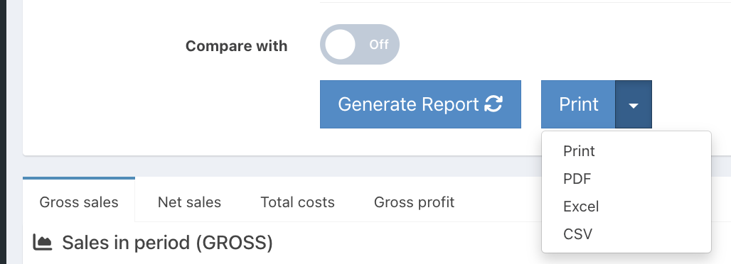
Note: Switching to different tabs of the sales report will show you the equivalent figures for net sales, cost and gross profit.
Comparing with previous periods
You can compare your sales with the sales for a comparison period by switching the Compare with toggle to On and then selecting a comparison period from the dropdown list:
- Week- will compare the sales with the equivalent days from the previous week
- Month - will compare the sales with the equivalent period from the previous month
- Year - will compare the sales with the equivalent period from the previous year
- Period - will compare the sales with the equivalent duration period preceding the time range you are viewing

Note: When comparing with the previous year, the comparison period will be adjusted to compare with a like for like period using the same days of the week. If instead you would like to compare with the exact dates of the previous year, switch the toggle, Compare exact dates to on.
You will see:
- The overall percentage change over the comparison period at the top of the graph next to the total box
- The percentage change in the average transaction value
- The comparison period sales plotted on the graph as a dashed line
- The percentage change for each point on the graph in the table below the graph
Exporting
You can also export/print the data in a table format, PDF, Excel, or CSV, by clicking the white Dropdown arrow next to the Print button.
Was this article helpful?
That’s Great!
Thank you for your feedback
Sorry! We couldn't be helpful
Thank you for your feedback
Feedback sent
We appreciate your effort and will try to fix the article